February 12, 2010

How to Display your Artwork and Photography

You've got your own space, the furniture is in, and you even have a few accessories.  Yet, there is something missing.  The space still feels empty for some reason. 
Your problem is most likely a lack of artwork on the walls.  No matter how filled a space is on the floor, it can still feel empty if the walls are empty.  This is especially true the taller your ceilings get.  But where do you start you ask?  That's exactly what we're going to talk about today.  We're going to take a look at different ways to fill up your walls with artwork and the best ways to plan it out.
There are a couple different ways you can go about displaying artwork or photography.  Listed below are a few examples of artwork displays and how they might work in your space.

GALLERY LAYOUT
A gallery layout gives emphasis to each piece of artwork.  They are usually not grouped together but instead left to stand alone.  Each piece is spaced at least one frame width away from the next piece.  Gallery layouts are also hung so that the center of each piece is at eye level.  This is usually around 63-66" from the ground, but is of course not possible to be exact for everyone.  Eye level is of course a guideline.  Certain situations may guide you in a different direction.  For example, when hanging a tall vertical piece, it might be best to hang the piece a bit lower so that the top third of the artwork is at eye level. 

SYMMETRICAL LAYOUT
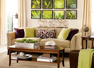
Symmetrical layouts are great for people that like order.  They help to give spaces a sense of calm and tidiness.  When working with a symmetrical layout the frames should all be the same type (*see below for exception) , the subject matter should be somewhat similar or have a theme, and the artwork should be hung straight and level.  This type of layout takes the most time to hang due to all the measuring.  The frames do not need to be all the same size or type as long as the layout is mirrored on both sides (In other words if you put a 5x7 on the bottom left of the wall then you would put a 5x7 on the bottom right of the wall.  And if you put a black frame on the top left of the wall then you would put a black frame on the top right of the wall).

ASYMMETRICAL LAYOUT
Asymmetrical layouts are freer flowing and are great to add interest to a space.   These are great if you plan on building upon them, but they can also be the most difficult to keep in balance with the space.  Different frames, themes, and even mediums (photography, paintings, etc.) can be used as long as they stay in balance.  As an example, if you have three small white frames on the left, try and put one large white frame on the right to balance it out.  Another great feature of the asymmetrical layout is that they are easier to hang.  The pictures do not need to line up exactly so there is a lot less measuring involved.


General Artwork Layout Tips

  • Keep the size of the artwork in proportion to the wall space. Small pieces on small walls, large pieces on large walls, tall skinny pieces on tall skinny walls, etc.
  • If artwork is hung above a piece of furniture make sure that the artwork is not longer than the width of the furniture. As a general rule you should keep the artwork width (or limits in the case of a grouping) to 75% of the furniture's width.
  • If artwork is hung above a piece of furniture such as a sofa, credenza, headboard, or dresser, hang them such that the bottom of the artwork or group of artwork is approximately 6-12 inches above the piece of furniture.
  • If possible try to illuminate your artwork. This can be done with track lighting, directional can lighting, or wall arc lighting.
  • When selecting artwork look to the space you are going to put it in for inspiration. A piece of artwork should complement the space that it is in. Neutral colors will give a calm effect while bold colors will make a statement.
  • One large piece will call more attention to itself than several smaller ones covering the same amount of space. For areas that you want to call attention to such as above a fireplace, use one large dynamic piece.
  • Horizontal lines in artwork or artwork hung in a horizontal formation will tend to make the space look wider and gives a more casual and calm atmosphere to a space.
  • Vertical lines in artwork or artwork hung in a vertical formation will tend to make the space look taller and gives a more elegant and dynamic atmosphere to a space.
  • Make sure that your hanging hardware is secure enough for the artwork that you are hanging. Always check the weight limits before selecting your hardware. Hardware boxes will usually state their weight limits.
  • Artwork framed or matted in a contrasting color to the wall will stand out more than one that is framed and matted in a color that is similar to the wall color.

  • A fun way to make small artwork look larger is to create a larger frame around a small piece of artwork with picture molding.  Attach the picture molding to the wall and hang the piece of artwork in the center of it.

GETTING STARTED

Step 1:  Select what type of layout you are going to do (Gallery, Symmetrical, or Asymmetrical).

Step 2:  Work with the layout on a table or on the floor until you are happy with the end result. 
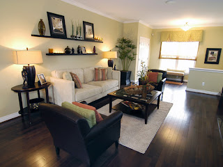
If possible lay a large sheet of paper down first so that you can trace each frame in its final position.  This will save you time when it comes to measuring.  All you will have to do is tape the paper on the wall (painter's blue tape works best), poke a nail hole where the hangers will go (*Make sure to measure and mark this on the paper before you put it on the wall.  See step 3 for how to do this.), and remove the paper from the wall. 

If you do not have a sheet of paper large enough for the entire ensemble then you can trace each frame on newspaper and cut them out to size.  This will give you the ability to tape each paper on the wall to confirm the layout.  You then will hang your hardware over each piece of paper (*make sure to measure and mark this on the paper before you put it on the wall. See step 3 for how to do this.), then pull the paper off the wall.

A third more technical option would be to take a photo of the wall you need to place artwork on.  Upload the image onto your computer and use the editing tools to draw rectangles where you might like your artwork to go.

Step: 3  After you have your layout figured out it's now time to hang your artwork.  If you've made templates in step 2 then this will be quite easy as described above.  Remember when hanging multiple pieces of artwork that picture hangers are not always located at exactly the same location on each frame so it's always best to measure out each one.  You can do this by measuring from the top of the frame to the picture hanger and also measuring from one side of the frame to the picture hanger.  This will give you your exact picture hanger location.  This is essential for a symmetrical artwork grouping layout.  After you've hung your first piece of artwork, measure the distance to your next piece (a good distance between frames is approximately 3 - 12 inches depending on the size of the piece).  Lightly mark on the wall where the top of your frame should be.  Measure down from that point to where your picture hanger should be.  If needed check your measurement for the horizontal placement of your picture hanger.  This especially needed if you are doing a vertical grouping so that all frames line up or if you are marking on a paper template.  Remember if you are marking on a template that your measurements will be opposite so either account for that or turn your paper over before placing on the wall.  Once you have your exact picture hanging location place your hanger and hang your artwork.

Step 4:  Use a level and make sure all of your artwork is level.  Next, use artwork putty, artwork rubber glides, or double faced foam tape on the back of the artwork at the bottom to keep your piece from shifting.  Putty and glides are less permanent while double faced tape is permanent but very secure.

Step 5: Step back and admire your work.  You deserve it!

***Remember, these are just guidelines.  They are by no means the absolute rules.  In the end rely on what makes you feel good.  That's the best piece of advice I can give you.

January 7, 2010

Office Feng Shui

Organized office … Organized Mind!


What images and feelings come to mind when you think of work? Do you think stress, tension, and tight deadlines? How about boredom, sleepiness, or that urge to just get the day over with? If so then you’re not alone. There are many people in today’s workforce that are not completely satisfied with their work life. What if I said there might be a way to make your work life more stress free, peaceful, productive, prosperous, and overall enjoyable?

In this blog I would like to introduce you to Office Feng Shui. Office Feng Shui will guide you down a path to create simple, conscious living in the workplace that will help you relax while accomplishing plenty at the same time.


To clear your mind, clear your work space.


What is Feng Shui?

The art of Feng Shui is the art of placing and arranging matter and space in the correct manner so that the energy (or Chi) can flow through our space such that harmony with the environment is achieved.  Creating a good energy flow is said to give good luck while creating a bad energy flow is said to give bad luck.

Feng Shui for your Desk

Keeping your personal space in order opens the flow of chi and stimulates your creativity. Try and keep your desk clutter free. Clutter creates stagnation, reduces your effectiveness, and leaves you feeling lethargic and confused. Set up a time each day or week to focus on organization. Each day before you leave try and do a quick overall organization (clear desktop clutter, empty trash can, etc.) Each week set up a day and time to do a more detailed organization of a certain part of your desk (file drawer, computer files, bookshelf, rolodex, e-mail, etc.).

When setting up the location of your desk the best location will have a wall behind you and facing the entrance to your office. Sitting with your back to the door will cause you to feel startled when people enter and body tension from turning around repeatedly. It is also symbolic of turning your back on life’s opportunities. If you can not set up your desk facing the door, place a mirror on your desk or on the wall in front of you so that you can easily have a view of the doorway.

Desktop Map of Success


The desktop map of success is comprised of five interrelated circles that represent different areas of your desktop. Focusing on one, a few, or all of these areas will help to enrich these areas of your work life.

Circle of Calm (bottom left of desk) – When you’re calm and focused, you will succeed in all your projects. If you desire peace and wisdom, place a religious icon or nature postcard in this circle.

Circle of Courage (top left of desk) – It takes courage to tackle all the work challenges that you face day after day. If you desire more prosperity, place a small money tree or a fish bowl in this circle.

Circle of Care (top right of desk) – Demonstrate care and compassion for yourself and those you work with. If you desire more care, place a family photo or flowers in this circle.

Circle of Connections (bottom right of desk) – When you reach out, you can make powerful contacts with clients, coworkers, and everyone else you interact with. If you desire more clients and support, place a small globe of the world in this circle.  This might also be a good spot for your phone.

Circle of Creativity (center of desk) – When all of the other desktop circles are in balance, you will have unlocked the key to unlimited creativity. Let this creative-power spot in the center of your desk be the launch pad for your success. If you desire more success, it is essential that you keep this power spot in perfect order.

Your Computer

Keep your computer and its screen clean. Make sure you set up your computer screen so that you are facing straight towards it. Make sure that there is no glare and that your body is completely at ease while working at it.  Make sure that the contents of your computer are also as organized as your desk. Remember, an organized office equals an organized mind! You can also select a background screen in a color that sooths your eyes. Try purple, blue, or green. You can also display a soothing nature screen saver. Try a nice scene incorporating water which is energizing and symbolic of abundance and health.

Your Phone

Place an attractive cloth (red is a prosperous color) under the phone to help activate its energy and get the phone ringing with positive opportunities.

Keep you phone clean and shiny as a sign of devotion to your work.

Set up your phone on the same side of the desk as your favored listening ear. This way the telephone wire won’t awkwardly cross your desk or computer screen.

Make calls in comfort by using a headset. This will greatly reduce any neck or shoulder tension.

For good luck, try taping a penny or Chinese coin to the base of the phone to generate good fortune.

Display a small card with words of inspiration on the phone, as a reminder to be friendly and attentive during your conversation.

Your Chair

Make sure that you have a chair that feels comfortable and supportive. A good ergonomic chair can go a long way when it comes to productivity in the work place.  If you are not completely comfortable with the chair your company provides you then bring in your favorite chair from home or go out and buy your own. Your comfort will more than repay the effort and expense.

The Sounds of Your Office

The sounds of your office may be creating a distracting aura around you. Try playing some soothing music at a low volume or if your office does not allow music try a “white noise” method of clearing the air. A desktop fountain, fan, or sound machine with natural sounds, all work well to create white noise.

Artwork and Your Office

Use your office artwork to your advantage. Hanging a picture of mountains behind you provides a symbolic wall of support. Do not hang a picture of hills, mountains, or big buildings in front of you. These symbolize insurmountable challenges and obstacles. Instead try hanging a picture of water (ocean, stream, waterfall, etc.) in front of you on your desk or wall. These will give you a soothing reflective mood and are energizing, symbolizing abundance and health. If hung behind you though, they will symbolize missed opportunities.

Other Ways To Bring Good Chi to your Office

Mirrors – Mirrors help to keep good chi moving around your office. Never hang a mirror facing a door or window (it will reflect the good chi right back out of your office), and make sure to hang it so that the reflection will not cut off anyone’s head. Also avoid mirrored tiles (which will break up the good chi).

Lucky Pennies – Affix coins at different locations in your office that you want to see prosperity (cash register, money box, phone etc.) or wrap three coins in a red cloth and place in an area that you want the chi to flow more abundantly.  The number three invites good fortune. 

Plants – Place greenery wherever you want to stimulate enthusiasm and abundance. Make sure to take care of your plants. Dead plants will give bad luck. A plant in a red pot will stimulate income.

Water – Adding water to your space can increase creativity. Try a small fountain or fish bowl in small spaces or a large aquarium in large spaces. Make sure to take care of your water feature and don’t go too big or it will drown your creativity.

Color – Use colors that will get the results you want.
  • Green inspires growth in business; it has a calming, relaxing influence.
  • Black increases mental activity and improves communications.
  • White encourages prosperity and has a calming effect. It also increases determination and mental clarity.
  • Yellow and Brown symbolize stability in your life and helps you stay grounded. Yellow also helps you to feel cheerful and optimistic.
Light – The best type of light is incandescent lighting. Fluorescent lights leave you feeling tired and grumpy. Try adding a lamp on your desk if you can’t change out the main lighting. Put it your desk opposite of your dominate hand so that you do not create shadows. Well balanced lighting can alleviate headaches, squinting, and eyestrain.

Feng Shui and your Cubicle

The smaller the space, the more important that you keep it organized. Also try and make your space comfortable even though you’re out in the open. Add pictures of family or nature to create a calm peaceful atmosphere. A small picture with a distant nature scene will make your cubicle seem larger. Gaze at it whenever you are feeling cramped. You can also add a plant at the end of your cubicle to divide your space from heavy traffic and wandering eyes.


I hope these tips help you to create a work space filled with good flowing energy and your work days become days you come to enjoy instead of dread. 


December 18, 2009

Designing Interiors Using Color Psychology (Part II)

The Psychology of color is a complex and greatly opinionated topic. With so many variables and views it’s hard to say what information is correct and what information is just myth. In Part II of this topic I’ve tried to pull together the most common theories of each color and a few ways you might be able to use them. I hope you have fun reading about each of them and they help you create fun spaces within your life. For some added fun after reading about each color try going to this link to take your own color personality test. http://www.viewzone.com/luscher.html


Black
The color black can go two different ways. On one hand black is very elegant, sophisticated, and powerful. On the other hand black can also come off as evil or bring up the feeling of mourning and death. Which way the color is perceived all depends on where it is placed, in what quantity, and what it is paired with.

When using black (or any color for that matter) remember that using too much of the same color in an extremely saturated state will make the psychological effects of the color only that much stronger and the feeling will primarily lean toward the negative effects of the color rather than the positive. Think of the saying “Too much of a good thing”.
Also remember that black is a dark color so the more you use in a space the smaller it’s going to feel. I like to use black as an accent piece that contrast the colors and items I want to draw viewers’ eyes to by creating definition.


White
The color white gives off the feeling of purity and innocence, yet if used too much or in the wrong way it can also give off a cold and sterile feeling (think hospitals). Being the opposite of black, white will usually make a room feel larger and more airy. If you are going to use excessive amounts of white in your space by keeping all of the walls white or by using large amounts of white furniture and furnishings, there is a way to offset the negative effects that this might cause. Try using different tints of white on top of each other. Another way to warm up white is by using different textures. Try putting a white leather sofa on a white shaggy rug, or a soft cashmere blanket on top of soft silk sheets. It also helps to just add a pop of color here and there to the items that you really want to stand out and make a statement in the room.

I like to use white as my highlighter in a space. When using lots of color in a space white trim, doors, and/or ceilings, will always brighten the room and bring out the light and crispness in each color.


Grey
Grey is the middle ground between black and white. It is for this reason that grey can be a tricky color to use. Used alone a grey room can feel bland and boring. Paired with another color, grey can now take on a sophisticated, modern feel.

Grey provides a great neutral base to a space in which to pop another color from. Paired with white and/or black you can get a very chic, modern space. Throw in a splash of another bright color like hot pink, orange, or lime green and you’ve really made a statement.

Keep in mind that although grey is a neutral color, it too can be warm or cool. Warm greys have a slightly beige tint to them and take on the characteristics of warm colors. Warm greys should be paired with other warm colors (red, orange, yellow). Cool greys have a slightly blue tint to them and take on the characteristics of cool colors. Cool greys should be paired with other cool colors (blue, green, purple).


Red
Red is on the warm side of the spectrum. It’s not just warm, it’s hot! Some say red is the most powerful color we have. If red is in a room our eyes are automatically drawn to it. The brighter and more true the red, the more intense the feeling will be.

Red in its subtle tones or used sparingly gives off feelings of love, warmth, and comfort. Red used in its purest, darkest, and most vibrant form gives off feelings of intensity, excitement, power, anger, and passion. Red is also known to increase a person’s heart rate, breathing, and blood pressure. If relaxation is what you are going for then Red is not the color to work with. Oddly enough red is also known to enhance our appetite. This is why the food industry is so fond of the color red. Red also makes meat look better so any restaurant or food establishment selling or serving red meat would be smart to choose the color red.


Orange
Orange is a combination of red and yellow. Mix the vibrancy of red with the happiness of yellow and you have orange. Orange is an energetic, cheerful, and warm color. Of all the colors in the spectrum, orange is probably the warmest of them all.

As with all colors the tint and intensity of the color orange makes a big difference in how one will feel in a space. A bright pure orange is great for drawing ones attention, while a burnt orange is a great color to cuddle up with. Try orange in a breakfast nook. It’s a fun color to wake up to and energize you for the day.


Yellow
Yellow is one of the hardest colors to work with. Although it is said to give off feelings of happiness, warmth, and sunshine, it is also hard on the eyes and tends to cause feelings of anger and frustration if used too much. Babies tend to cry more often in a yellow room and adults tent to feel cranky and frustrated. It is for this reason that yellow should be used with caution (funny that yellow means caution) and toned down in most cases. Pale buttery yellows are the most commonly and successfully used colors of yellow.


Because of yellow’s eye grabbing ability, it is also known to help a person’s memory and ability to recall information. If you want someone to remember a particular element or space, make it yellow (think yellow sticky notes and yellow note pads).


Green
Green is commonly known to symbolize nature. Its psychological effects give us the feeling of relaxation, tranquility, and calm. Hospitals once made it a standard to have green scrubs and green décor. It was said to calm the patients and create a soothing environment. Although hospitals have now broadened their horizons and added in a wide spectrum of color, green is still used quite often in spaces that want to give off a feeling of peace and relieve stress.

Green is best used when mixed with several shades of green or other shades of blue, yellow, or brown. Think of yourself in a forest. The forest is not one shade of green. It is millions of shades of green, yellow, and brown, with a blue sky for the backdrop. Mixing several shades of green and its related colors will give a more natural feel to your space, thus giving you a more tranquil and relaxing feeling. Add a pop of color and you’ll have the full effect of complete relaxation. It’s like your flower in a sea of grass.


Blue
Blue is hands down one of the most popular colors in society. If a large group of people were asked their favorite color, a large amount of them would say blue with men being in the majority. Blue gives off feelings of calmness, and serenity, and it is often described as peaceful, tranquil, and secure. Used too much though, blue can give off feelings of loneliness and sadness (think “the blues”). Blue is also thought to be a great color when it comes to productivity. This is why so many schools and corporate offices use the color blue. This could also be due to the fact that blue surroundings make us feel colder and in colder environments we’re more likely to stay wide awake.

Another fun fact is that blue tends to make us feel less hungry (a great tidbit in this age when everyone is on a diet). This is probably due to the fact that there aren’t very many foods in nature that are blue. To ward off hunger try painting your kitchen and dining room blue, or go to the extreme of eating your food off of blue plates. Theory says that you will eat less.


Purple
Purple is the symbol of wealth, royalty, wisdom, and spirituality. The color tends to favor our feminine side, but men have also been fans of the color for many years. Purple is a mix of the color blue and the color red. For this reason it is on the cusp of being a warm color and a cool color. Purple with more blue in it seems to be more calm, serene, and mysterious. Purple with more red in it attracts more attention and can sometimes be perceived as cheap. Purple as a soft tint gives off a dainty girlie aura, although if the tint leans more toward being a grey then the color can seem modern and almost masculine.


Pink
Pink is essentially a light red and is usually associated with love and romance. The color is thought to have a calming effect which is why some prisons paint the inmates cells pink and some sports teams paint the opposing team’s locker room pink (to relax them more that they’d like to be). It is also for the calming effect that babies rooms are usually pink (blue for a boy, which is also a very calm color).

Western societies usually tag pink as a feminine color, but in many European countries pink has been used equally for both men and women. Although many men in America may not want to surround themselves with pink, they cannot deny that they are drawn to pink treats due to the sweet sensations that the color pink gives off.


Brown
Brown is the color of the earth. It is a great neutral to any space and generally gives off a warm feeling. The color also gives off feelings of comfort, security, strength, and reliability. Brown is also said to be the intelligent color (is that where the brunette idea came from).

Using the color brown is all about texture and tone. A rough texture mid-tone brown can make the color look rustic and old world. A clean smooth texture mid-tone brown can make the color look rich and traditional. A gloss finish on a dark-tone brown can look modern.

Be careful when picking out a brown for your space. Brown is actually a mix of almost every color so you need to pay attention to what color is prominent. You wouldn’t want to pick a brown with a yellow or orange base for a red or pink room. You also wouldn’t want to pick a brown with a red base for a yellow room. You are usually safe with a good neutral brown that does not dominate in color but they are hard to find in the design world. For a designer picking out the perfect brown is like picking out the perfect white. There are just so many shades but never the perfect one.

December 5, 2009

Designing Interiors Using Color Psychology (Part I)

Why are nurseries usually designed in light colors? Why are so many office buildings shades of blue and beige? Why are most fast food restaurants designed in bright color schemes? Each of these questions and many more can be answered using color psychology.


What is color psychology?


Color psychology is the study of the effect that colors have on the moods, behavior, and feelings of people. Its use is found primarily in interior design and marketing helping people understand how individual colors invoke positive or negative feelings which are used to promote products or create a desired atmosphere inside a home or business.


Color Therapy


Color psychology was also used in several ancient cultures including Egyptian and Chinese, with the belief that colors could be used to heal. Alternative Therapists still apply this method, referring to it variously as chromo therapy, light therapy, or colourology. According to this theory, red stimulates the mind and body, and increases circulation. Yellow was thought to stimulate the nerves and purify the body while orange was used to heal the lungs and to increase energy levels. Blue is believed to soothe illnesses and treat pain while Indigo shades are said to alleviate skin problems.


Color Psychology Basics


Temperature - Warm vs Cool
One of the most well known principles of Color Psychology is the designation of warm and cool colors. Colors on the warm side of the color spectrum include red, orange, and yellow. These warm colors evoke emotions ranging from feelings of warmth and comfort to feelings of anger and hostility. Colors on the cool side of the spectrum include blue, purple, and green. These colors are often described as calm, but can also call to mind feelings of sadness or indifference. Then there are the beiges and muted grays that don’t really have a definite warm or cool projection in interior design color psychology. These are referred to as temperature neutral.


Tone – Dark vs Light
In addition to color temperature, tonal value also plays a role in interior design color psychology. Lighter tones are more reflective and as a result we see these as moving away from us. They give the illusion of more space and lighter in weight. On the other hand darker tones reflect less light and appear closer to us. This creates the sense of a closer more intimate space or a feeling of heaviness.

Saturation – Pure vs Muted
The more saturated a color is, the more intense of a feeling it projects (see part II of this blog for the feelings each color projects). Saturated or "pure" colors are colors that are closest to their base hue (red, yellow, blue). The more grey added to a color the less saturated it is.

The appropriate interplay of a color’s temperature, tone, and saturation will help you achieve the feel you are aiming for in a room.


Applying Color Psychology to Interior Design


Before you settle on an interior color scheme, it’s good to be clear how you will use each space in your project whether it is your home or your business.

It’s also a good idea to be aware of what type of lighting each space will primarily be used in. Will the space only be used at night with incandescent table lamps, or will it mostly be used in the day with lots of natural sunlight. Maybe the space is lit with fluorescent light fixtures. Whatever the case may be it is essential that all color selections be made in the type of lighting that they will be used. No color is the same in all types of lighting.

The next step is to ask yourself, “How do I want to feel in this space?” - Do you want to feel calm and focused? Maybe you want to feel energized and motivated. In other spaces you might want to feel warm and secure. Here is where color psychology can provide you with information and options.

Remember to take a look at the three basics of Color Psychology (Temperature, Tone, & Saturation).


Warm colors can make a space feel warm, cozy, and comforting, although used in great amounts or in dark hues one can feel more excitement or anger. Warm colors also tend to advance visually. The positive aspects of this are a closer, cozier feeling environment. If you have a large space that lacks an intimate appeal, consider using colors from this part of the spectrum.


Cool colors tend to make a space feel calm and crisp, although used too much or in too strong of a hue the feeling can turn cold and gloomy. Colors on the cool side of the color wheel also tend to recede visually suggesting a more airy open environment. This is an aspect of interior design color psychology to consider if you are struggling with how to enhance a small space.


Another way to create a space that appears larger than it really is, or a space that appears cozier and more comforting than the space really lends to, is with light and dark colors. Light colors will make your space feel larger while dark colors will make your space feel smaller.

Don’t forget saturation. The more saturated or “pure” a color is, the more intense of a feeling it will put off.

Part II of this BLOG will talk about each of the main 11 colors that are universal by name: Red, Orange, Yellow, Green, Blue, Purple, Black, White, Grey, Brown, & Pink. Each color gives off its own feeling and energy that can make or break the design of a space.

Utilizing color psychology in your spaces can help you to create the right “mood” that you are looking for. Color psychology is a very interesting aspect of interior design but don’t worry about getting it right. It’s definitely not an exact science. No color has been scientifically proven to have the same effect for all humans. Such factors as eye sight, culture, and personal experiences can change a person’s perception of color. Still, research does show that we all share some basic responses to color. So when you set out to decorate your new home or office, color psychology can provide you with the most promising color candidates for the effects you want to achieve.

November 17, 2009

Welcome!

Welcome to the idea space of Shanna Lynn Interiors. It is here that you will find advice on designing a functional space, the latest materials to use and how to use them, as well as do it yourself projects that will save you money without sacrificing style. With over 9 years of experience I still love learning more about design every day. The possibilities are endless, and although there is much in design that is classic and will always have its place in the world of design, the design world is also an ever changing field with new ideas every day, giving us much to learn, use, and teach to others as we go.

Each month I'll post a new idea, DYI project, new material, or other helpful tidbit that will aid in your design efforts. Please feel free to contact me with any topics that you would like to see on here, or any questions that you might have in the future on topics that have already been discussed. I hope you all enjoy this continuing blog and are able to use what you learn here in your own lives and spaces.

Please join me next month for my first "official" BLOG and design topic.